Hierarchical Data Grid Overview and Configuration
The Ignite UI for Web Components Hierarchical Data Grid is used to display and manipulate hierarchical tabular data. Quickly bind your data with very little code or use a variety of events to customize different behaviors. This component provides a rich set of features like data selection, excel style filtering, sorting, paging, templating, column moving, column pinning, export to Excel and CSV, and more. The Hierarchical Grid builds upon the Flat Grid Component and extends its functionality by allowing the users to expand or collapse the rows of the parent grid, revealing corresponding child grids, when more detailed information is needed.
Web Components Hierarchical Data Grid Example
In this Web Components grid example you can see how users can visualize hierarchical sets of data and use cell templating to add other visual components.
Getting Started with Ignite UI for Web Components Hierarchical Grid
Dependencies
To get started with the Web Components hierarchical grid, first you need to install the igniteui-webcomponents-grids package.
npm install --save igniteui-webcomponents-grids
You also need to include the following import to use the grid:
import 'igniteui-webcomponents-grids/grids/combined.js';
The corresponding styles should also be referenced. You can choose light or dark option for one of the themes and based on your project configuration to import it:
import 'igniteui-webcomponents-grids/grids/themes/light/bootstrap.css';
Or to link it:
<link rel='stylesheet' href='node_modules/igniteui-webcomponents-grids/grids/themes/light/bootstrap.css'>
For more details on how to customize the appearance of the hierarchical grid, you may have a look at the styling section.
Using the Web Components Hierarchical Data Grid
Data Binding
The igc-hierarchical-grid derives from igc-grid and shares most of its functionality. The main difference is that it allows multiple levels of hierarchy to be defined. They are configured through a separate tag within the definition of igc-hierarchical-grid, called igc-row-island. The igc-row-island component defines the configuration for each child grid for the particular level. Multiple row islands per level are also supported. The Hierarchical Grid supports two ways of binding to data:
Using hierarchical data
If the application loads the whole hierarchical data as an array of objects referencing children arrays of objects, then the Hierarchical Grid can be configured to read it and bind to it automatically. Here is an example of a properly structured hierarchical data source:
export const singers = [{
    "Artist": "Naomí Yepes",
    "Photo": "assets/images/hgrid/naomi.png",
    "Debut": "2011",
    "Grammy Nominations": 6,
    "Grammy Awards": 0,
    "Tours": [{
        "Tour": "Faithful Tour",
        "Started on": "Sep-12",
        "Location": "Worldwide",
        "Headliner": "NO",
        "Toured by": "Naomí Yepes"
    }],
    "Albums": [{
        "Album": "Dream Driven",
        "Launch Date": new Date("August 25, 2014"),
        "Billboard Review": "81",
        "US Billboard 200": "1",
        "Artist": "Naomí Yepes",
        "Songs": [{
            "No.": "1",
            "Title": "Intro",
            "Released": "*",
            "Genre": "*",
            "Album": "Dream Driven"
        }]
    }]
}];
Each igc-row-island should specify the key of the property that holds the children data.
<igc-hierarchical-grid auto-generate="true">
    <igc-row-island child-data-key="Albums" auto-generate="true">
        <igc-row-island child-data-key="Songs" auto-generate="true">
        </igc-row-island>
    </igc-row-island>
    <igc-row-island child-data-key="Tours" auto-generate="true">
    </igc-row-island>
</igc-hierarchical-grid>
[!NOTE] Note that instead of
datathe user configures only thechildDataKeythat the igc-hierarchical-grid needs to read to set the data automatically.
Using Load-On-Demand
Most applications are designed to load as little data as possible initially, which results in faster load times. In such cases igc-hierarchical-grid may be configured to allow user-created services to feed it with data on demand.
<igc-hierarchical-grid id="hGrid" primary-key="customerId" auto-generate="true" height="600px" width="100%">
    <igc-row-island id="ordersRowIsland" child-data-key="Orders" primary-key="orderId" auto-generate="true">
        <igc-row-island id="orderDetailsRowIsland" child-data-key="Details" primary-key="productId" auto-generate="true"></igc-row-island>
    </igc-row-island>
</igc-hierarchical-grid>
import { getData } from "./remoteService";

export class HierarchicalGridLoadOnDemand {
    constructor() {
        const hierarchicalGrid = document.getElementById("hGrid") as IgcHierarchicalGridComponent;
        const ordersRowIsland = document.getElementById("ordersRowIsland");
        const orderDetailsRowIsland = document.getElementById("orderDetailsRowIsland");

        ordersRowIsland.addEventListener("gridCreated", (event: any) => {
            this.gridCreated(event, "Customers");
        });
        orderDetailsRowIsland.addEventListener("gridCreated", (event: any) => {
            this.gridCreated(event, "Orders");
        });

        hierarchicalGrid.isLoading = true;

        getData({ parentID: null, rootLevel: true, key: "Customers" }).then((data: any) => {
            hierarchicalGrid.isLoading = false;
            hierarchicalGrid.data = data;
            hierarchicalGrid.markForCheck();
        });
    }

    public gridCreated(event: CustomEvent<IgcGridCreatedEventArgs>, _parentKey: string) {
        const context = event.detail;
        const dataState = {
            key: context.owner.childDataKey,
            parentID: context.parentID,
            parentKey: _parentKey,
            rootLevel: false
        };
        context.grid.isLoading = true;
        getData(dataState).then((data: any[]) => {
            context.grid.isLoading = false;
            context.grid.data = data;
            context.grid.markForCheck();
        });
    }
}
const URL = `https://data-northwind.indigo.design/`;

export function getData(dataState: any): any {
    return fetch(buildUrl(dataState))
        .then((result) => result.json());
}

function buildUrl(dataState: any) {
    let qS = "";
    if (dataState) {
        if (dataState.rootLevel) {
            qS += `${dataState.key}`;
        } else {
            qS += `${dataState.parentKey}/${dataState.parentID}/${dataState.key}`;
        }
    }
    return `${URL}${qS}`;
}
Hide/Show row expand indicators
If you have a way to provide information whether a row has children prior to its expanding, you could use the HasChildrenKey input property. This way you could provide a boolean property from the data objects which indicates whether an expansion indicator should be displayed.
<igc-hierarchical-grid data="data" primary-key="ID" has-children-key="hasChildren">
</igc-hierarchical-grid>
Note that setting the HasChildrenKey property is not required. In case you don't provide it, expansion indicators will be displayed for each row.
Additionally if you wish to show/hide the header expand/collapse all indicator you can use the ShowExpandAll property.
This UI is disabled by default for performance reasons and it is not recommended to enable it in grids with large data or grids with load on demand.
Features
The grid features could be enabled and configured through the igc-row-island markup - they get applied for every grid that is created for it. Changing options at runtime through the row island instance changes them for each of the grids it has spawned.
<igc-hierarchical-grid data="localData" auto-generate="false"
    allow-filtering='true' height="600px" width="800px">
    <igc-column field="ID" pinned="true" filterable="true"></igc-column>
    <igc-column-group header="Information">
        <igc-column field="ChildLevels"></igc-column>
        <igc-column field="ProductName" has-summary="true"></igc-column>
    </igc-column-group>
    <igc-row-island child-data-key="childData" auto-generate="false" row-selection="multiple">
        <igc-column field="ID" has-summary="true" data-type="number"></igc-column>
        <igc-column-group header="Information2">
            <igc-column field="ChildLevels"></igc-column>
            <igc-column field="ProductName"></igc-column>
        </igc-column-group>
        <igc-paginator per-page="5"></igc-paginator>
    </igc-row-island>
    <igc-paginator>
    </igc-paginator>
</igc-hierarchical-grid>
The following grid features work on a per grid level, which means that each grid instance manages them independently of the rest of the grids:
- Sorting
- Filtering
- Paging
- Multi Column Headers
- Hiding
- Pinning
- Moving
- Summaries
- Search
The Selection and Navigation features work globally for the whole Hierarchical Grid
- Selection Selection does not allow selected cells to be present for two different child grids at once.
- Navigation When navigating up/down, if next/prev element is a child grid, navigation will continue in the related child grid, marking the related cell as selected and focused. If the child cell is outside the current visible view port it is scrolled into view so that selected cell is always visible.
Collapse All Button
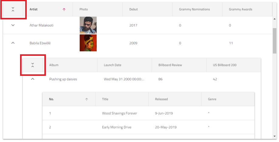
The Hierarchical Grid allows the users to conveniently collapse all its currently expanded rows by pressing the "Collapse All" button at its top left corner. Additionally, every child grid which contains other grids and is a Hierarchical Grid itself, also has such a button - this way the user is able to collapse only a given grid in the hierarchy:
Styling
In addition to the predefined themes, the grid could be further customized by setting some of the available CSS properties. In case you would like to change the header background and text color, you need to set a class for the grid first:
<igc-hierarchical-grid class="grid"></igc-hierarchical-grid>
Then set the --header-background and --header-text-color CSS properties for that class:
.grid {
    --header-background: #494949;
    --header-text-color: #FFF;
}
Demo
Known Limitations
| Limitation | Description |
|---|---|
| Group By | Group By feature is not supported by the hierarchical grid. |
API References
HierarchicalGridRowIslandIgcGridComponentIgcColumnIgcCell
Our community is active and always welcoming to new ideas.